What Actually Sells at the Checkout (And What Doesn’t)
Most checkout areas are either wasted space or overloaded. You’ll see counters with nothing on them, or counters packed with random items that don’t move. Neither setup works particularly well.
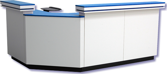
The checkout zone isn’t for bulk selling. It’s for quick decisions.
The Customer Is Already Done Shopping
By the time someone reaches the counter, they’ve made their main choices. They’re not browsing anymore. They’re waiting.
That changes how you should use the space.
A cash register display counter should focus on low-effort add-ons. Items that don’t require much thought, sizing, or comparison. If a product needs explanation, it’s in the wrong place.
Keep It Small and Clear
This is where a lot of stores go wrong. They try to fit too much into a small area.
The result:
- cluttered surfaces
- products getting ignored
- staff struggling to work around it
You’re better off showing fewer items, but presenting them clearly. A tight selection always performs better than a crowded one.
Product Type Matters More Than Price
It’s not about putting cheap items at checkout. It’s about putting easy items there.
Good checkout products tend to be:
- simple to understand
- quick to pick up
- easy to add to an existing purchase
Think accessories, small upgrades, or practical add-ons. Anything that feels like a natural extension of what the customer is already buying.
Don’t Get in the Way of the Transaction
This is the biggest mistake.
If your display interferes with scanning, bagging, or payment, it’s hurting sales more than helping. Staff need space to work. Customers need a clear area to place items and pay.
The display should sit alongside the process — not inside it.
Positioning Makes a Difference
Where you place items on the counter affects whether they get noticed.
Products directly in front of the customer tend to work best. Anything off to the side or behind the staff gets overlooked. The customer should be able to see and reach items without leaning or asking.
Eye line matters, even at the counter.
Rotation Keeps It Working
Checkout displays go stale quickly.
If the same items sit there for weeks, regular customers stop seeing them. Rotating products keeps the area active and gives different items a chance to sell.
You don’t need to change everything. Even swapping a few items makes a difference.
Staff Should Know What’s There
If staff aren’t aware of what’s on the counter, they won’t mention it.
A quick prompt like “Do you need one of these?” can move products, but only if staff know what they’re pointing at. Keep the selection simple enough that it’s easy to talk about.
Keep It Easy to Maintain
Checkout areas get messy fast.
Receipts, bags, customer items — everything passes through that space. If your display is too detailed, it won’t stay tidy for long.
Simple layouts are easier to reset. That consistency matters more than a complex setup that falls apart during the day.
What This Comes Down To
The checkout counter isn’t for showing everything. It’s for catching a few extra sales without slowing anything down.
If the setup is clear, accessible, and easy to maintain, it will work. If it gets in the way, it won’t — no matter what you put on it.